
COPD Educational Material
Introduction
This project taught me that technology doesn’t necessarily mean advanced equipment. For it to apply knowledge and enable action, it can be anything as long as it’s carefully designed.
This faculty-led research in particular, has a very noble objective and one of the most social-driven outcomes; a piece of paper. Yes! A piece of paper that took hours and hours of context understanding, infinite little tweaks and lots of prototyping.
My Role
Observed and interviewed physicians, nurses and pharmacists in the emergency department, created the veteran’s illustrations, generated multiple iterations of the prototype, tested the prototype.
Timeline
The project was developed in 16 weeks dedicating 15-20 hrs. a week by a team of four, one project manager (Senior Design Strategist) from the Population Health Sciences department from The University of Illinois at Chicago (UIC) and three Institute of Design (ID) students during the fall of 2018.
Credits: Beneficiaria del Programa de Becas de Estudios en el Extranjero FONCA CONACYT 2017.

The Problem
Chronic Obstructive Pulmonary Disease (COPD) patients at a VA hospital in Chicago keep returning to the emergency department with pulmonary flare-ups. Every time they have an exacerbation, they lose a lung function percentage, leading eventually to death.
To avoid flare-ups, patients are given educational materials to learn how to take care of themselves at home, however, most of these are not effectively designed, they don’t consider context, usability and user-centered needs, and more importantly, they lack guideline-based content (when a document doesn’t follow a healthcare GOLD standard, in other words accurate healthcare based and evaluated in scientific evidence).
Design Approach
Provotypes: We started out with low fidelity prototypes in order to learn how to organize the content and language. This rough type of sketch is what we call a provotype (a prototype that’s intended to provoke ideas and discussion with stakeholders) eventually, we learned from mistakes and mad it better in the next iteration.
We developed various versions of this provotype on post-it notes so that clinicians remove things and create their ideal document. This approach helped us to get clarity on guideline-based care, medications, and treatments ourselves before we got further into the design process.
Design best practices: Once we got clarity on the guideline-based care, language and medications, we started to apply some best practices of information design--hierarchy, white space, color, visual and contextual cues, line length, etc.
Despite of knowing how documents could look pretty, the problem was beyond a graphic design solution.
So, we started to address the end-user experience thinking how clinical staff would provide the material and how patients would interact with it. Observations and interviews allowed to gather some insights.
-Patients don’t identify with the current materials. They do not portray someone like the VA’s population.
- Current materials focus merely on being instructional rather than action oriented.
- COPD is treated (most of the times) with inhalers and in order to be compliant patients need to learn a set of instruction to avoid confusing their inhalers. Most patients are old and can’t remember detailed instructions since their reading level is below 8th grade.
-Moonlighting ED’s staff may have different healthcare practices, making treatment and education difficult to standardize.
We created a symptom-focused version with the first page focusing on the first 5 days after discharge, and the inner spread focused on longer-term care based on symptom severity. We also started experimenting with illustrations and format 11x17 format.
After more observations, we realized that we were missing an important piece of the puzzle; we needed to make the document more culturally tailored to the VA population at Jesse Brown. That’s when we incorporated veteran language such as: strength, vigilance, defending yourself, respect, and others.
Although we weren’t sure about this approach, we decided to test it at the hospital, so we set a table and gathered veteran’s feedback.
Veterans were such an inspiration for the illustration style that we ended up using. We developed custom illustrations designed to be culturally tailored in order to create a sense of empathy. We wanted veterans to identify with.
We combined the veteran-focused approach with an action-oriented approach based on additional feedback from our testing.
“It’s all there on one chart.... could put this on the fridge.”
We created at least 25 iterations of the document. We refined the language and visuals here based on several rounds of feedback from different stakeholders.
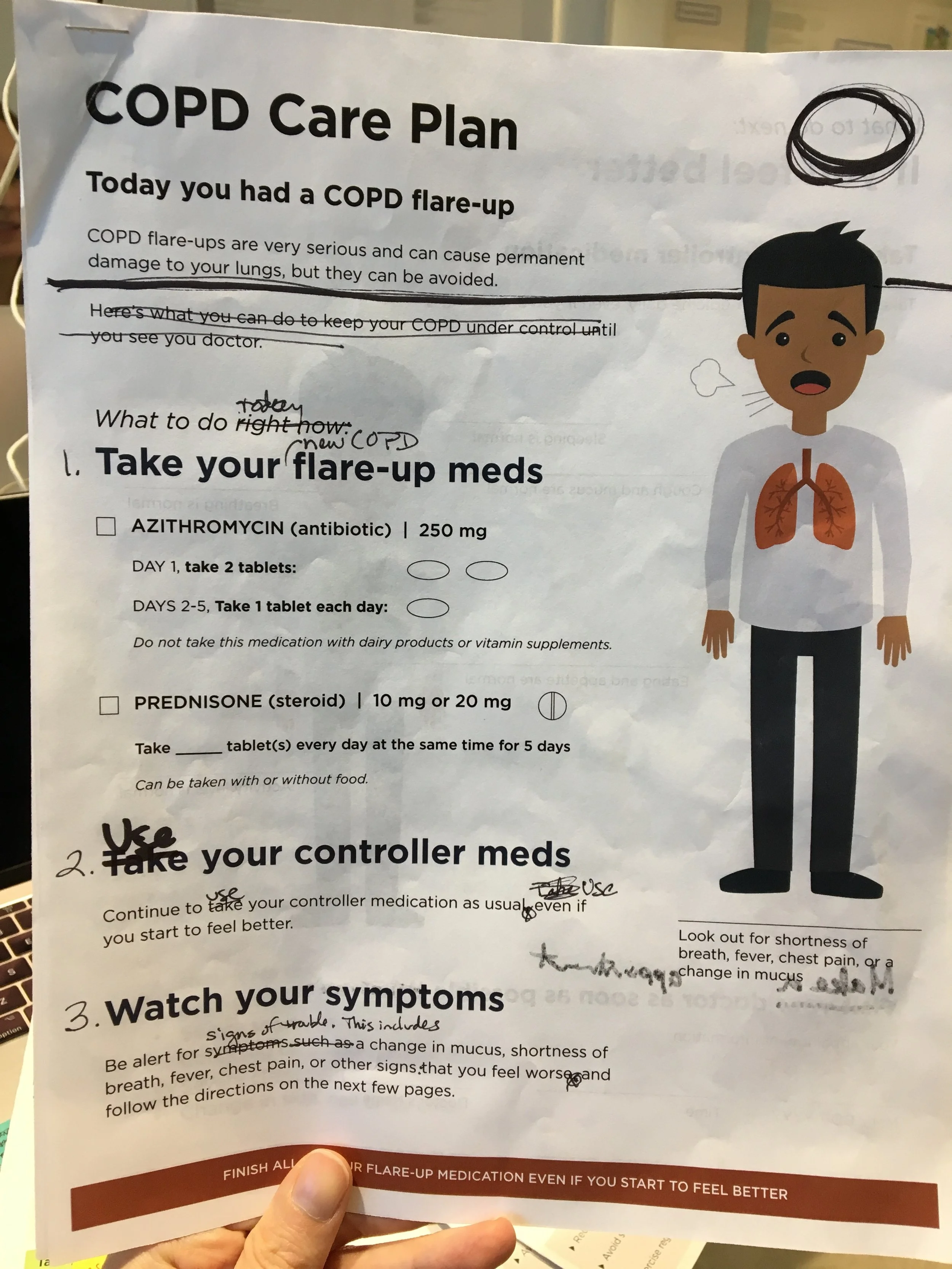
The front page addresses the first 5 days after discharge.
The inside spread addresses longer term self-care using a stepped-up care escalation approach.
The back page focuses on correct inhaler technique. Takes the instructions provided by the VA while reducing word count and reading level (word count: 586, reading grade level: 5.3) shows one action per illustration for simplicity and uses culturally tailored illustrations
Proposal
How can design be used to create a better education document for ED discharge?

current educational materials


provotype iterations

testing the prototypes at the V.A.

Client feedback:
“We want to test it right the way, this is something that we need”
Next Steps:
In the Spring 2018 the team decided to purse a piloting phase in order to expand the document to other point of care in the VA system.
Acknowledgments: Special shout out to Shelly Kurzynski and Pooja Chaudary, the dream team that helped this project be successful and collaborative. And, a big thanks to Kim Erwin and Jenny Sculley to be mentors and teachers throughout the process.